Wednesday, June 11, 2008
New Blog Project - The Raw Files
An exciting project I am starting with a friend of mine. http://therawfiles.blogspot.com/
Friday, May 23, 2008
Light Set Up
Monday, May 19, 2008
A Little Before & After
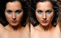
I have seen a few sites as of late that show before and afters of beauty style work done by professional photographers and retouchers. Since beauty is a genre that very much interests me I am always on the look out for techniques to achieve the looks many of these photographers create. More than ever I am convinced that the retouching plays a HUGE role in the final image despite all that you read about how lighting techniques are responsible for the look of these images. Yes, you need to start with decent light but it need not be complicated at all. This image was shot with a single large silver umbrella placed high and right beside me. I was hugging the light stand.
Anyway, here is a before and after showing what the light contributed to the image and what Photoshop contributed. Believe me, this is how many of those great beauty shots you see look like before (left image!)--sometimes worse. I am still learning to retouch my images and it is not an easy thing to do well. (Depending on how your display is set up this image will probably appear too bright and Blogger seems to make the image too warm as well. Who knows?!) If you aren't retouching your work and trying to achieve that 'beauty' look though lighting alone you are going to be a very frustrated photographer.
Friday, May 16, 2008
Life Gets in the Way...
Wow. I have been so busy doing things I have neglected my blog. I plan on returning soon with a cool project involving a buddy photographer of mine and two models. Stay tuned.
Tuesday, February 19, 2008
Seeing Beyond the Nudity
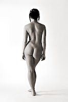
I have had my eye on this girl, Jessie, for about a year now and finally figured it was time to ask her if she wanted to pose for me. I had a feeling that she had a stunning body, but I wanted to be sure which is why I waited so long before asking her. She was game and we met at my studio along with her sister, Noelle, who I have known for a few years. As we were shooting, Noelle remarked that Jessie didn't even seem naked. As soon as Noelle said that I lowered the camera from my eye and just stood there--stunned. Exactly! She nailed it.
I have been trying to put into words the idea of art nudes not being about a 'naked girl', but something more--much more. To create and view these types of images and not see the 'nudity' is an evolution that many people haven't reached. Noelle and I have reached that next level of appreciation of the nude form in all that it has to offer above the obvious. I was shocked that Noelle actually said it--that she was seeing they way I was seeing.
Many of you may be at this evolved level of thought, but I just found it so profound that Noelle didn't even notice that the model was nude. I am still trying to wrap my head around the idea that the form was so beautiful that the nudity was lost. I am not new to the ability to view an art nude without seeing the 'nudity' I have just never really been able to put it into words until Noelle did it for me. Perhaps one day more people will view art nudes and not notice the 'nudity'--at least in our somewhat less evolved western society.
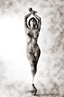
The image below was an ispirtaion from image I saw a while ago. The photo was very similar and done with a stunning Canadian figure model (I think she is from Ontario if I remember correctly). I wish I could give credit to the orignal artist and model, but I do not know who created the image. If some one knows of the image and its creators that I am talking about please let me know so I can give proper credit for the ispiration for my version.
Monday, January 14, 2008
Too Busy!
I am up to my eyeballs with everything right now hence the lack of posts here. I have closed down one of my businesses and I am in the process of starting a new one (both non-photography related). With that, family and other obligations I am a bit short of time these days. I do promise to get back into the swing of things in a little while and hopefully provide some good info to you.
Saturday, December 29, 2007
Tinkering Around
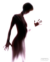
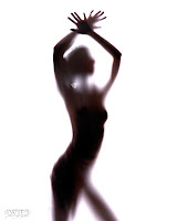
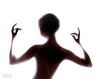
Sometimes playing around just for the sake of it can lead to some interesting images. I shot this lovely young lady over the holidays and it was our second session together. She had originally found me through some headshots I had done for another lady and was interested in trying some nude modeling. Anyway, I was tinkering around towards the end of the shoot to see what would happen if I put a wet sheet in front of the model and strongly backlit her.
I was very pleased with the results of my little experiment. I didn't meter the lights and set them up by feel. The lights behind her were f16 (set from a previous setup) and the light out front was just there for fun I think. I am not sure it was doing anything other than providing a bit of fill across the front of the sheet. I shot the images at f8 to keep the background pure white. The only image manipulation I did in Photoshop to these was to duplicate the background layer and change the new layer's blending mode to 'multiply' thereby underexposing the image and negating the effect of the front light. I like the look of the darker form behind the sheet. I have included a shot of the actual setup below. Please excuse my studio-in-progress. At least it is boarded and heated now!

Thursday, December 6, 2007
Harsh or Hard?
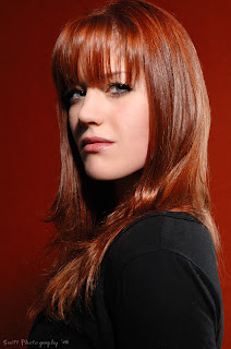
When I first started in photography I learned that shadows were bad. People always talked about "filling in shadows" and "watch the harsh shadows". Shadows are bad they'd say. So I spent several months avoiding shadows like the plague. That was a mistake--shadows are great. You need to learn to understand and control your shadows to create the specific looks you want. One of the biggest misconceptions I was lead to believe is this term "harsh" to describe shadows that are "hard". This term, "harsh", has a negative slant to it and I believe is the wrong word to use when describing a shadow that is indeed hard. That term most certainly dissuaded me from using hard shadows and I consequently spent much time agonizing over whether my shadows were soft enough.
Just what is a hard shadow? Well, if you are accustomed to using a point & shoot camera with an dinky little on-camera flash you will have no doubt seen hard shadows. These are shadows which have a clear and defined edge. That is the transition between the diffused highlight (the properly exposed portion) and the shadow is abrupt and well defined. The light that creates this type of shadow is often called "harsh" and more often than not used to negatively describe the light quality. Too many photographers are afraid of hard light, usually characterized by a relatively small light source. Generally hard light is unflattering, but when you use it effectively the images can be fantastic.
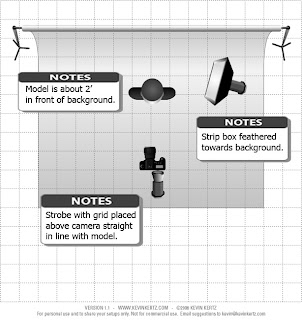
The image above is an example of hard light or hard shadow, which ever you prefer. I purposely chose this style of lighting to bring out her skin and create a matching contrast between the shadows and her black shirt with the lightness of her skin. The two work to help bring attention to her skin and hair. I have attached the lighting setup for this particular shot below. Learn to use your shadows for effect and if you intentionally use a hard light source and some one tells you to "fill in your shadows" or "you should have used a more diffuse light source" you can now stand proud knowing that you chose to use a hard shadow on purpose an it isn't necessarily a bad thing. And it certainly isn't "harsh" as the word would imply.
Wednesday, December 5, 2007
A Second Look
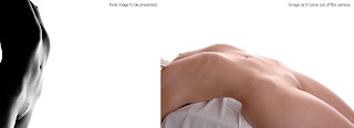
I have read many times where a photographer indicates that an image has not been cropped or it is straight out of the camera as though these statements are some sort of badge of honour--a feat that makes them somehow better photographers than the rest of us that use some form of post shoot alterations. I am of the opinion that it is the final image that matters. How one arrives at that final images is completely irrelevant. If you can nail a shot in the camera then good for you and I think that is a goal that should always be aimed for, but sometimes better images can be made if you give them a second look on the computer in the peace and quiet of your basement (or where ever your significant other happens to let you set up your machine!).
When I am finished with an image in my RAW converter I bring the image into Photoshop and the first thing I do is crop. I explore different aspect ratios and crop levels to bring out the best in the composition. You would be surprised how a slight crop, tilt or going from a 2:3 ratio to a 3:4 ratio can dramatically improve an image's overall composition. I do this religiously on every image. Some images come in just fine right out of the camera and others need some work. Often you can make several good images from one just by altering the crop.
The image shown above was from a shoot that wasn't going terribly well on my end. I accidentally hit the lock on my camera that prevents the focus points from being changed. I didn't realize I had done this and my focus point was stuck on the far bottom right corner when in landscape orientation. I thought my camera was all screwed up, but I figured out shortly after the session that I as a bit of a twit. Anyway, I was very frustrated and my studio wasn't finished as we had just moved in to the place so this was a makeshift shoot at best. The image on the right was as it is straight from the camera. Not too exciting in the least, but I saw a good image hidden within. A little bit of cropping, rotating, recomposing by adding a huge white negative space, converting to black and white, and deepening the shadows completely transformed a shot surely destined for the trash into the image on the left--a keeper for sure.
So don't think that the images you see out there haven't gone through some sort of manipulation to get to the final one you are seeing. Am I less of a photographer for creating the image on the left from the image on the right? I don't think so. If I hadn't shown you what the image really looked like you would never have known. What I find frustrating about this lovely little post work is that when you are trying to figure out how some one lit a particular shot or what have you, the sky is the limit. You could be dealing with something exactly like I am showing you here and you could bang your head against a wall trying to figure out how it was done. Could I have composed and lit that final image in the camera? Of course, but I didn't on this particular day and I created it out of a very bad picture. Nothing wrong with that. In closing I'd just like to tell you to give your images a good looking over after you shoot them--you may find some great images if you aren't afraid to do a little revamping in the computer.
Friday, November 30, 2007
Studio is Almost Ready!
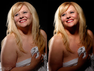
Over the last few weeks I have been converting my detached garage into my studio space. It is 27' wide by 32' deep. I would like a little more depth, but what can you do? I had the heater installed yesterday so now I can begin to paint and get 'er all ready to shoot in. I actually have to squeeze in a maternity session this week before I can start painting and organizing. Once I am up and running I can start doing a bunch of work in the studio to give some information to those looking at studio lighting. I am also trying to learn how to do video tutorials so I can show some of my post processing work, but I haven't found anything online yet to show me how to do it. The above picture shows some of my retouching work (click on it to see it larger).
Thursday, November 29, 2007
Finding Neutral Grey in an Image
As I wait for my studio to get finished (heater is going in as we speak!) so I can start providing some studio lighting information here is a useful little technique to find the neutral grey point in your image. Create a new blank layer and fill it with 50% grey change the blending mode to 'difference' Whoa! Some funky business, eh? What this basically did was show us where the neutral grey point is. You see, any color that matches 50% grey (or darn close) will become black. All the other colors aren't the grey we are after. Now you need to create a 'threshold' adjustment layer and move the slider all the way to the left--you should see a white screen. This is going to allow us to find that black point in the image that our previous step created. I like to highlight the number and use my 'up arrow' key to move the slider just until I start to see the first bits of black show up on the screen. Click OK on that adjustment layer. Zoom into those spots. Now create a 'curves' or a 'levels' adjustment layer and select the grey eyedropper in the dialogue box. Place the eyedropper on the black area and then you can click OK on the adjustment layer. Deleted the 'threshold' and the 'difference' layers and toggle the curves/levels adjustment layer on and off so you can see what you have done.
If your adjustment looks good to your eye then you can merge that layer down or whatever you normally do. You can also adjust the opacity of the layer to suit. If there is no truly neutral grey in the image this technique may mess up your colors a little bit or you may just not like the adjustment on this particular image. If that is the case then you can just delete the adjustment layer and move on. I am assuming a certain competence with Photoshop here in that you know how to do all of those commands and where to find the respective tools. If you don't, please shoot me a message and I'll gladly help you out in more detail.
If your adjustment looks good to your eye then you can merge that layer down or whatever you normally do. You can also adjust the opacity of the layer to suit. If there is no truly neutral grey in the image this technique may mess up your colors a little bit or you may just not like the adjustment on this particular image. If that is the case then you can just delete the adjustment layer and move on. I am assuming a certain competence with Photoshop here in that you know how to do all of those commands and where to find the respective tools. If you don't, please shoot me a message and I'll gladly help you out in more detail.
Monday, November 26, 2007
The Land of the Internet
Ah, life on the internet. Loads of valuable information at your fingertips and heaps of bullshit at every turn. I have been a member of a few message boards in my continuing search for good information to take my photography to that ever moving 'next level'. I have noticed that while there are a few very good people on these boards there are a few that, for whatever reason, like to make the experience miserable. These people, hiding behind the anonymity of their computers, love to be rude, uncivil, and even threaten other members. I have found very little useful and consistent information on many of these message boards and you have to weed through the threads of bickering and name calling to find this information. Many of the posters on these sites have no link to their own work and hide behind screen names whilst they sling their mud and 'advice'. The constant bickering over which new camera is the 'best' or which features of a yet to be released camera aren't going to function correctly is emotionally, intellectually draining, and somewhat addictive--much like a soap opera.
In my internet travels I have come across some great websites and they are always a photographer's site. These people offer tutorials and valuable insights into their photography. I will work on putting a list of these sites together so you can browse for great information without all of the grief and drama that message boards seem to be about. I for one will not be participating on message boards any longer. They are, for the most part, counterproductive and a waste of time--time you could be using to read good information, shooting or, in my case, creating a decent source of information for other photographers to learn a thing or two. A blog may not be as 'interactive' as a message board, but at least the information won't be clouded by the incessant bickering and tough-guy attitudes the internet has allowed people to get away with. I don't hide behind a fake screen name and I post my work. You, as the reader of my information, can see my work and take my advice for what you think it is worth. I am a real person, a real photographer, and willing to share my knowledge and opinions freely and honestly with others.
In my internet travels I have come across some great websites and they are always a photographer's site. These people offer tutorials and valuable insights into their photography. I will work on putting a list of these sites together so you can browse for great information without all of the grief and drama that message boards seem to be about. I for one will not be participating on message boards any longer. They are, for the most part, counterproductive and a waste of time--time you could be using to read good information, shooting or, in my case, creating a decent source of information for other photographers to learn a thing or two. A blog may not be as 'interactive' as a message board, but at least the information won't be clouded by the incessant bickering and tough-guy attitudes the internet has allowed people to get away with. I don't hide behind a fake screen name and I post my work. You, as the reader of my information, can see my work and take my advice for what you think it is worth. I am a real person, a real photographer, and willing to share my knowledge and opinions freely and honestly with others.
Wednesday, November 21, 2007
A Nifty Little Trick
Want a very fast way to add a bit of snap to your images? Try this: Duplicate your background layer twice. Select the top layer and press 'option+command+tilde' (the squiggle under the escape key). This selects the highlights in the image. Once you have the highlights selected press command+j to put it to a new layer. Change that new layer's blending mode to 'softlight' and POP! Nice, eh? Now, if this warmed up your image too much you can merge that layer down to the second background copy and then change that merged layer's blending mode to 'luminosity' then you can merge that layer down onto your first copied background layer. This is why you duplicate the background twice...to do the luminosity thing if your image gets too warm. This way you get the pop of the effect without the color change. I find that the color boost can help an image in many instances. You can also duplicate that highlight layer a couple times and play with opacities if need be. I use this method all the time to add a bit of snap--quickly. Give it a try and feel free to ask me any questions if you can't figure it out. Oh, sorry PC users, I am not sure what your version of the short cut keys are. I think 'command' is 'ctrl' and 'option' is 'alt'.
Monday, November 19, 2007
Practice, practice, practice!
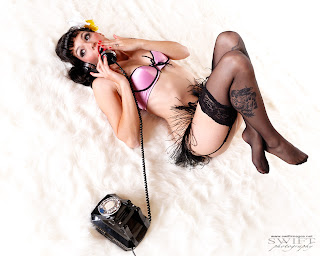
I often have new photographers asking me how I get my images to look the way they do. There really are no secrets to what I do although I am sure the people in my Inspiration list have secrets! When I first picked up a camera I was less than thrilled with the quality of the images. My first camera was a Nikon D70s. I snapped away for months and was completely frustrated that my images lacked the sharpness, color, polish, etc. that I saw many other photographers work to possess. Now, I am talking image quality here and not composition and subject choice which are topics for another discussion. Why wasn't my work looking like theirs? We all use the same device don't we? We can all push a shutter button. We hear all the time that equipment doesn't matter and I have found that they are right--it doesn't matter (most of the time anyway).
What I have found to be important in getting great image quality is control of the contrast in the situation, control of your exposure, your ability to focus accurately and deliberately, and the work you do (or don't do!) in post processing. The later of which is very important. All of these aspects take time to develop a proficiency that will transfer into better quality images. I'll tell you that I didn't understand that and after a few months of using my D70s and blaming it for the lack of image quality I was getting I went out and spent a small fortune on the best camera equipment I could buy. At least now I couldn't blame my gear for my bad images.
While that bought me some peace of mind and tools that I could grow into instead of out of the act didn't do anything to make my work better. In fact it made it worse for a short time until I learned how to handle the new camera. I guess what I am saying is there are no secrets to getting good quality images. You need to practice your techniques and understanding of light and get decent with your post processing skills. I am still learning and striving for a higher level of image quality and I have a lot yet to learn. If you aren't doing post work on your images then you are losing out big time making them the best they can be. I can bet you five bucks and a pinch of 'coon shit that many of the images you admire do not come straight out of the camera. If the photographer tells you that and you believe it then I have a bridge I'd like to sell you--cheap.
Subscribe to:
Comments (Atom)
